Guides · Tutorial
Dockable panels in PowerBuilder: a Visual Studio layout for your window
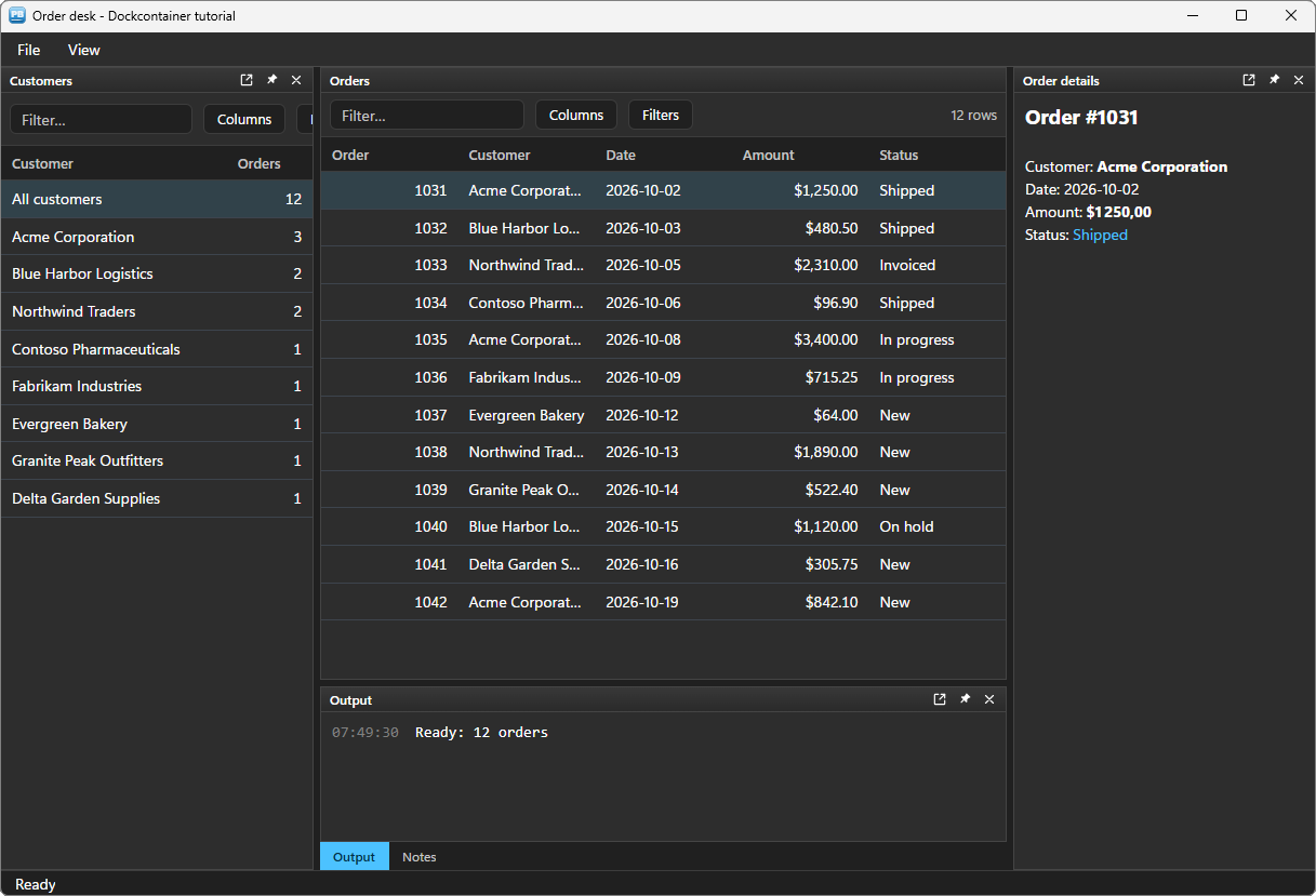
A PowerBuilder screen that grows ends up as a jigsaw: a list on the left, a DataWindow in the middle, a detail on the right, a log at the bottom — each control placed by hand in the resize event, and each user stuck with the arrangement the developer chose. Visual Studio, Outlook or SQL Server Management Studio solved that long ago: dockable panels that the user drags, stacks as tabs, folds onto an edge or floats onto a second monitor — and finds again the next morning.
This tutorial gives a PowerBuilder window that layout with u_pbt_dockcontainer. Its panels host your own controls — native PowerBuilder controls or other PBToolboxAI components — and each keeps its own events. The dock only moves them.
We will build a small order desk:
- the orders, a datagrid, in the central area;
- the customers on the left, a second datagrid, to filter the orders;
- the order details on the right, in rich text;
- an Output log and the Notes of the order — a code editor — stacked as two tabs at the bottom.
On top of that: a classic View menu that shows and hides the panels, a question before closing notes that are not saved, a counter on a tab that hides new lines, and the user's layout kept from one session to the next. Every line of code below comes from the sample application: the window w_tuto_dock of the PBToolboxAI demo, opened by its Tutorials tab.
What you need #
- PowerBuilder 10.2 → 2025 (32 or 64 bit).
- Windows 10 or 11: the Microsoft WebView2 runtime the component relies on is already there.
- The PBToolboxAI demonstration package — free, from the downloads page. It holds
pbtoolboxai.pbl,pbtoolboxai.dlland the sample application of this tutorial.
The finished code. Open
pbtoolboxai_demo.pbwfrom the demonstration package and run it: the Tutorials tab of its ribbon opens the sample of this tutorial, the windoww_tuto_dock, with its DataWindowsd_tuto_ordersandd_tuto_dock_customers. Their source is inpbtoolboxai_demo.pbl, ready to read or to copy.
Demo mode. In your own application, without a licence key, the dock runs in demo mode: three panels at most, and a small DEMO badge. The order desk has five. The grids and the editor have their own demo limits; the rich texts are free.
Step 1 — Prepare the target #
- Copy
pbtoolboxai.pblinto your application folder and add it to the library list of your target. - Copy
pbtoolboxai.dll— the x86 copy, since the PowerBuilder IDE is 32-bit — next topbXXX.exeor into the working folder of the target, so that the IDE finds it when you run.
That is the whole installation. The DLL carries everything else — the HTML of the panels, the themes, the translations — as embedded resources.
Step 2 — The application object #
Declare three functions of the DLL, then set the licence and the theme before the first window opens, so that nothing ever flashes:
// Local External Functions of the application object
Function long PBT_SetLicense (string as_client, string as_key) Library "pbtoolboxai.dll"
Function long PBT_SetDefaultTheme (string as_name) Library "pbtoolboxai.dll"
Function long PBT_Warmup () Library "pbtoolboxai.dll"
// open event of the application object
// Starts the WebView2 engine in the background : the first window opens at once
PBT_Warmup()
// Your licence key. Without one the dock runs in demo mode :
// three panels, and a DEMO badge
PBT_SetLicense(/*client*/ "Your company", /*key*/ "your-licence-key")
// The theme of every component
PBT_SetDefaultTheme(/*name*/ "fluent-dark")
Open(w_orders)Step 3 — Place the dock and the controls #
In the window painter, place a userobject of class u_pbt_dockcontainer and name it uo_dock. Then place the controls the panels will show, anywhere on the window — where they land does not matter, the dock moves them:
| Control | Class | Panel |
|---|---|---|
uo_orders | u_pbt_datagrid, fed by a DataStore of d_tuto_orders | Orders — the central area |
uo_customers | u_pbt_datagrid, fed by a DataStore of d_tuto_dock_customers | Customers |
uo_details | u_pbt_statictext (rich text) | Order details |
uo_output | u_pbt_statictext, written as a log | Output |
uo_notes | u_pbt_codeeditor | Notes |
The data lives in two DataStores, ids_orders and ids_customers, created in the window's open event; the grids only show them. A DataWindow control or a ListBox docks exactly the same way.
Add a u_pbt_menubar named uo_menu at the top, and a u_pbt_statusbar named uo_status at the bottom: both follow the theme like the panels, dark included.
The dock fills the room between them. The resize event keeps it so — the dock then moves its panels, and their controls, by itself:
// wf_layout () - called from open, from the resize event and from ue_auto_height of the menu bar

// The menu bar on top, the status bar at the bottom, the dock between them
uo_menu.move(0, 0)
uo_menu.width = this.WorkSpaceWidth()
uo_status.of_dock_bottom()
uo_dock.move(0, uo_menu.height)
uo_dock.resize(this.WorkSpaceWidth(), uo_status.y - uo_menu.height)
The menu bar takes the height its font needs and says so in ue_auto_height: calling wf_layout() there moves the dock below it.
Step 4 — Build the panels #
One of_add_panel per control: a key, a position relative to a panel already there, a size in pixels, a title, and the control to host.
// wf_build_dock ()

// The panels, one per control of the window : the control is moved into the dock
// and keeps its own events. The orders are the MAIN panel : the document area,
// which can neither be closed nor floated.
uo_dock.is_main = "orders"
uo_dock.of_add_panel(/*key*/ "orders", /*position*/ "", /*relative_to*/ "", /*size*/ 0, /*title*/ "Orders", /*content*/ uo_orders)

// The customers at the start of the orders, 290 pixels wide
uo_dock.of_add_panel(/*key*/ "customers", /*position*/ uo_dock.POSITION_START, /*relative_to*/ "orders", /*size*/ 290, /*title*/ "Customers", /*content*/ uo_customers)

// The order details at the end, with a short title for the narrow places
uo_dock.of_add_panel(/*key*/ "details", /*position*/ uo_dock.POSITION_END, /*relative_to*/ "orders", /*size*/ 280, /*title*/ "Order details", /*content*/ uo_details)
uo_dock.of_panel(/*key*/ "details").is_short_title = "Details"

// The output below the orders, and the notes stacked onto it as a second tab
uo_dock.of_add_panel(/*key*/ "output", /*position*/ uo_dock.POSITION_BOTTOM, /*relative_to*/ "orders", /*size*/ 170, /*title*/ "Output", /*content*/ uo_output)
uo_dock.of_add_panel(/*key*/ "notes", /*position*/ uo_dock.POSITION_STACK, /*relative_to*/ "output", /*size*/ 0, /*title*/ "Notes", /*content*/ uo_notes)

// The output tab in front of the notes
uo_dock.of_select_panel(/*key*/ "output")
What to know:
- The main panel (
is_main) is the document area of the window: it cannot be closed, floated or hidden, and no panel stacks onto it. Everything else arranges around it. - Positions are logical:
POSITION_STARTis the left in a left-to-right application and the right in a right-to-left one.POSITION_TOP,POSITION_BOTTOMandPOSITION_STACK(a tab of the panel named) complete the set. of_add_panelreturns a code:0once applied,-5for a key already taken or a reference that does not exist,-6in demo mode past the third panel.- A panel is driven by its handle:
of_panel(key)returns ann_pbt_dock_panelthat carries its properties — title, short title, visibility, pin, colours. The short title is shown where room is scarce: the edge rail of a folded panel, or a tab too narrow for the full title.
Every panel header already offers the user three buttons — float, pin (fold to the edge) and close — a right-click menu, and its tab or header can be dragged onto the docking guides to dock it elsewhere, exactly as in Visual Studio. You wrote none of that.
Step 5 — The hosted controls keep their events #
A control in a panel keeps its own events. Selecting a customer filters the orders, and a new order shows its details and its notes — in the events of the grids. A grid names its rows by their RowID and gives the selection as a JSON array; one small window function turns it into a row number:
// wf_row_of (datastore ads, string as_keys_json) returns long
// Local variables
long ll_quote, ll_end

// '["3"]' : the RowID of the row a grid selected ; '[]' when there is none
ll_quote = Pos(as_keys_json, '"')
if ll_quote = 0 then return 0
ll_end = Pos(as_keys_json, '"', ll_quote + 1)
return ads.GetRowFromRowId(Long(Mid(as_keys_json, ll_quote + 1, ll_end - ll_quote - 1)))
// ue_selection_changed event of uo_customers : (string as_keys_json)
// Local variables
long ll_row
// One customer, or all of them ; a selection emptied by a reload changes nothing
ll_row = parent.wf_row_of(parent.ids_customers, as_keys_json)
if ll_row > 0 then parent.wf_filter(ll_row)// ue_selection_changed event of uo_orders : (string as_keys_json)
// Another order : its details and its notes follow
parent.wf_show_order(parent.wf_row_of(parent.ids_orders, as_keys_json))The filter also changes the title of the panel. A panel title is rich text: the customer name goes in the accent colour. It is data, so of_escape_markup keeps a bracket in it from being read as markup:
// wf_filter (long al_customer_row) - "All customers" is the first row of the list
if al_customer_row <= 1 then
	ids_orders.SetFilter("")
	uo_dock.of_panel(/*key*/ "orders").is_title = "Orders"
else
	ls_customer = ids_customers.GetItemString(al_customer_row, "name")
	ids_orders.SetFilter("customer = '" + ls_customer + "'")
	// A title is rich text : the customer name is data, escaped
	uo_dock.of_panel(/*key*/ "orders").is_title = "Orders of [accent]" + inv_utils.of_escape_markup(ls_customer) + "[/accent]"
end if
ids_orders.Filter()

// Rows coming back from the filter go to the end : sorted again, by number
ids_orders.Sort()
wf_show_orders()
wf_show_orders gives the filtered DataStore back to the grid (uo_orders.of_from_datastore(ids_orders)) and selects its first order. The details of an order are rich text too, one line per field:
// wf_show_order (long al_row) - the details
il_notes_rowid = ids_orders.GetRowIdFromRow(al_row)
uo_details.is_text = "[size=14][b]Order #" + String(ids_orders.GetItemNumber(al_row, "order_no")) + "[/b][/size][br][br]" &
	+ "Customer: [b]" + inv_utils.of_escape_markup(ids_orders.GetItemString(al_row, "customer")) + "[/b][br]" &
	+ "Date: " + String(ids_orders.GetItemDate(al_row, "order_date"), "yyyy-mm-dd") + "[br]" &
	+ "Amount: [b]" + String(ids_orders.GetItemDecimal(al_row, "amount"), "$#,##0.00") + "[/b][br]" &
	+ "Status: [accent]" + inv_utils.of_escape_markup(ids_orders.GetItemString(al_row, "status")) + "[/accent]"
inv_utils is an n_pbt_utils, declared as an instance variable: it is autoinstantiated, nothing to create.
The dock also tells which panel holds the keyboard — a click in its control, the Tab key, a SetFocus in your code. The sample shows it in the status bar:
// ue_active_panel_changed event of uo_dock : (string as_key)

// The panel that holds the keyboard ("" : none, the focus left the dock)
if as_key = "" then
	parent.wf_status("Ready")
else
	parent.wf_status("Working in: " + as_key)
end if
Step 6 — A View menu that knows which panels are open #
The cross of a panel only hides it: its control stays in the dock, ready to come back. A View menu brings it back. The menu bar is built entry by entry in the window's open event; each entry is named by an address, the menu and the entry joined by /:
// wf_build_menu ()

// The menu bar, entry by entry : each entry is named by an address, the one
// wf_menu receives when it is chosen
uo_menu.of_add_menu(/*key*/ "file", /*text*/ "&File")
uo_menu.of_add_item(/*keys*/ "file/neworder", /*text*/ "&Simulate a web order")
uo_menu.of_add_separator(/*keys*/ "file")
uo_menu.of_add_item(/*keys*/ "file/exit", /*text*/ "E&xit")

// The View menu : a checked entry per panel, then what changes the layout
uo_menu.of_add_menu(/*key*/ "view", /*text*/ "&View")
uo_menu.of_add_item(/*keys*/ "view/customers", /*text*/ "&Customers", /*image*/ "", /*checked*/ true)
uo_menu.of_add_item(/*keys*/ "view/details", /*text*/ "Order &details", /*image*/ "", /*checked*/ true)
uo_menu.of_add_item(/*keys*/ "view/output", /*text*/ "&Output", /*image*/ "", /*checked*/ true)
uo_menu.of_add_item(/*keys*/ "view/notes", /*text*/ "&Notes", /*image*/ "", /*checked*/ true)
uo_menu.of_add_separator(/*keys*/ "view")
uo_menu.of_add_item(/*keys*/ "view/float", /*text*/ "&Float the order details")
uo_menu.of_add_item(/*keys*/ "view/autohide", /*text*/ "&Auto-hide the customers", /*image*/ "", /*checked*/ false)
uo_menu.of_add_separator(/*keys*/ "view")
uo_menu.of_add_item(/*keys*/ "view/reset", /*text*/ "&Reset the layout")
An entry chosen raises ue_item_selected with its address, and the window routes it in one place:
// ue_item_selected event of uo_menu : (string as_keys)
// An entry chosen : the window routes it by its address
parent.wf_menu(as_keys)
Already have a PowerBuilder menu? of_load_menu(menu) builds the bar from it instead, and runs the Clicked script of each item.
The check marks of the View menu must say which panels are open, whoever closed them. The dock is asked, it always knows:
// wf_sync_menu ()

// The View menu shows which panels are open : the user may have closed one with
// its cross, or reset the layout. The dock is asked, it always knows.
uo_menu.of_item(/*keys*/ "view/customers").ib_checked = uo_dock.of_panel(/*key*/ "customers").ib_visible
uo_menu.of_item(/*keys*/ "view/details").ib_checked = uo_dock.of_panel(/*key*/ "details").ib_visible
uo_menu.of_item(/*keys*/ "view/output").ib_checked = uo_dock.of_panel(/*key*/ "output").ib_visible
uo_menu.of_item(/*keys*/ "view/notes").ib_checked = uo_dock.of_panel(/*key*/ "notes").ib_visible
uo_menu.of_item(/*keys*/ "view/autohide").ib_checked = not uo_dock.of_panel(/*key*/ "customers").ib_pinned
It runs after every change — ue_panel_closed and ue_panel_pinned of the dock, and the menu itself. A View entry toggles its panel:
// wf_toggle_panel (string as_key)

// An open panel closes, as with its cross : ue_panel_closing may still refuse.
// A closed panel opens again, at the front of its stack.
if uo_dock.of_panel(as_key).ib_visible then
	if uo_dock.of_close_panel(as_key) = -4 then wf_status("The notes stay open.")
else
	uo_dock.of_panel(as_key).ib_visible = true
end if
wf_sync_menu()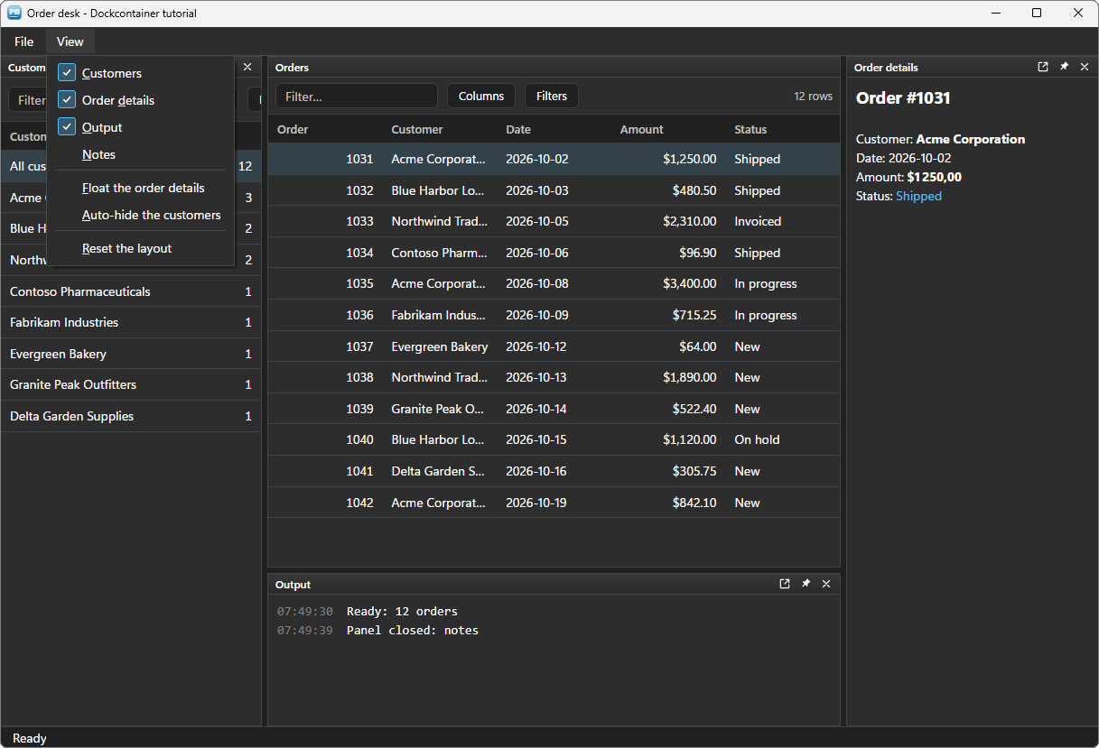
The two other entries of the menu drive the dock from code:
// wf_menu (string as_key) - two cases of the router
case "view/float"
	// A real floating window : it can go to another monitor
	uo_dock.of_float_panel(/*key*/ "details")
case "view/autohide"
	// The whole group of the panel folds to a strip on the edge of the dock
	uo_dock.of_panel(/*key*/ "customers").ib_pinned = not uo_dock.of_panel(/*key*/ "customers").ib_pinned
	wf_sync_menu()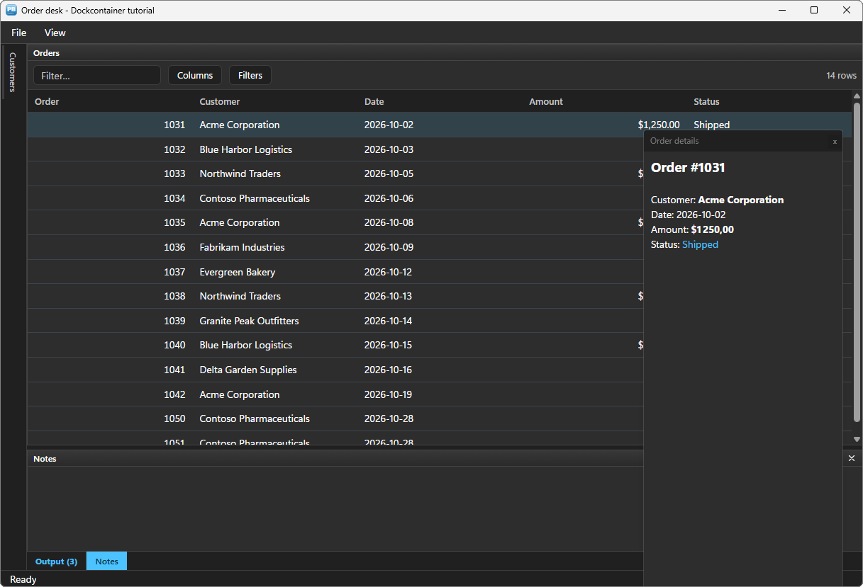
A floating panel lives in a real window: the user moves and resizes it, drops it on another monitor, and docks it back with a double-click on its title bar (ue_panel_docked says so). A folded panel opens as a sliding panel when its strip is clicked, and closes when the user works elsewhere.
Step 7 — Do not lose unsaved notes #
Closing the Notes panel loses nothing — it is only hidden — but a user who closes it means "I am done with this". If the notes of the order were changed and not saved, the window should ask. That is a veto: opt-in, so that every other dock pays nothing for it.
// open event of the window
// Ask before a panel closes (off by default) : the notes may hold unsaved work
uo_dock.ib_veto_close = true
// ue_panel_closing event of uo_dock : (string as_key) returns boolean
// Local variables
long ll_answer
// Only the notes can hold unsaved work : every other panel closes freely
if as_key <> "notes" then return true
if not parent.uo_notes.ib_modified then return true
// Yes keeps the notes, No drops them, Cancel keeps the panel open
ll_answer = parent.inv_mb.of_messagebox(Handle(parent), "Notes", "Save the notes of this order before closing the panel?", Question!, YesNoCancel!, 1)
choose case ll_answer
case 1
parent.wf_save_notes()
case 2
parent.wf_revert_notes()
case 3
return false
end choose
return true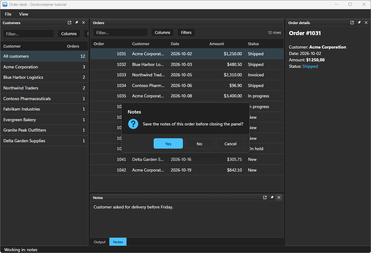
Returning false keeps the panel open, and ue_panel_closed does not follow. The question covers every way of closing — the cross, Close and Close others in the menu of a tab, the cross of a sliding panel — and your own code: of_close_panel then returns -4, which is what wf_toggle_panel above tests.
The box is n_pbt_messagebox, the free themed replacement of MessageBox() — see the dialogs tutorial. The notes know by themselves whether they changed: uo_notes.ib_modified turns true at the first keystroke, and stays false when the code writes a new text (is_text). wf_save_notes writes the text back into the order — found by its RowID, since a filter changes row numbers — then sets ib_modified back to false; wf_revert_notes reads the order's notes again.
Step 8 — A tab that counts what was not seen #
New lines in the log are worth knowing about, even when the Output tab sits behind the Notes. of_notify_panel puts a counter on the tab of a panel that is not in view; it clears itself when the user shows the panel:
// wf_log (string as_text)

// One line at the end of the Output panel : only that line travels, the view
// follows the end (ib_follow_end). The text is data : escaped, never read as markup.
uo_output.of_append_text(/*markup*/ "[gray]" + String(Now(), "hh:mm:ss") + "[/gray]  " + inv_utils.of_escape_markup(as_text))

// The output may be hidden, or behind the notes : its tab counts what was not seen.
// The count clears itself when the panel is shown.
if not uo_dock.of_panel(/*key*/ "output").ib_front then
	uo_dock.of_notify_panel(/*key*/ "output")
end if
The Output panel is set up once, in the open event, as a log:
// The output is a log : the view follows the end, the 500 newest lines are kept
uo_output.is_font_family = "Consolas"
uo_output.ib_follow_end = true
uo_output.il_max_log_lines = 500
uo_output.ib_selectable = true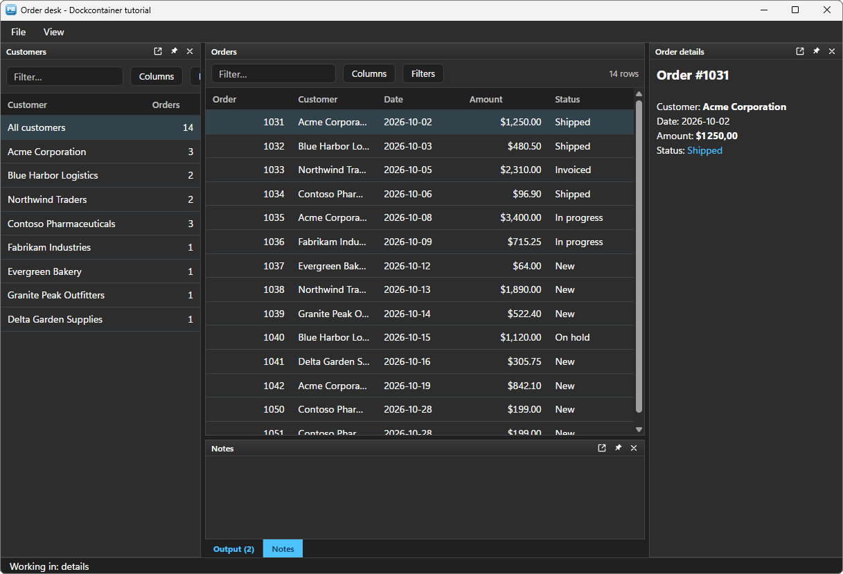
ib_front is read live: it is true when the panel is the one its stack shows. of_clear_notify clears the counter without showing the panel, when your code knows the new content is gone.
Step 9 — Keep the user's layout #
The arrangement the user makes — sizes, tabs, folded and floating panels, the place of each floating window — is one JSON text, the property is_layout. Saved when the window closes, given back when it opens, it makes the window theirs:
// close event of the window

// The layout of the user, for the next opening
RegistrySet(REGISTRY_KEY, "Layout", RegString!, uo_dock.is_layout)
destroy inv_mb
destroy ids_orders
destroy ids_customers
// open event of the window (the end ; the DataStores and the components are set up before)
// Local variables
string ls_layout
// The orders and the customers first : the panels show them at once
wf_load_orders()
uo_orders.of_from_datastore(/*ads*/ ids_orders)
uo_orders.of_column(/*key*/ "notes").ib_hidden = true
wf_load_customers()
wf_layout()
// The layout the user left last time ("" the first time). Read BEFORE the panels are
// built : building them raises ue_layout_changed.
RegistryGet(REGISTRY_KEY, "Layout", RegString!, ls_layout)
// Ask before a panel closes (off by default) : the notes may hold unsaved work
uo_dock.ib_veto_close = true
// Every panel, then the saved layout, in ONE burst : a single render
uo_dock.of_set_redraw(/*on*/ false)
wf_build_dock()
is_default_layout = uo_dock.is_layout
if ls_layout <> "" then uo_dock.is_layout = ls_layout
uo_dock.of_set_redraw(/*on*/ true)REGISTRY_KEY is a constant of the window, "HKEY_CURRENT_USER\Software\PBToolboxAI\Tutorials\Dock"; an INI file or a table of your database would do as well.
Three details matter:
- The panels are built first, the layout applied after. The layout arranges panels that exist. A panel it does not know joins a group next to the others, so a new version of your window that adds a panel still opens cleanly over an old saved layout; and a text that is not a layout changes nothing (
is_last_errorsays why). of_set_redraw(false)…(true)groups the five panels and the layout into a single render: the user never sees the default arrangement flash before theirs.is_default_layoutis read right after the build, before the user's layout. View › Reset the layout gives it back:
case "view/reset"
	// The layout of the first opening : panels back in place, closed ones shown
	uo_dock.is_layout = is_default_layout
	wf_sync_menu()
	wf_log("Layout reset")
If you prefer to save as the user goes, the event ue_layout_changed (string as_json) is raised after every change, with the whole layout.
Themes #
The dock follows the theme set by PBT_SetDefaultTheme — light or dark, Fluent or Office — and its ue_bg_color event reports the background colour of the theme, so that the window around it follows too:
// ue_bg_color event of uo_dock : (long al_color)
// The theme's background (a new theme, a new mode) : the window follows
parent.wf_follow_background(al_color)
The grids, the rich texts, the editor, the menu bar and the status bar are PBToolboxAI components: they follow the theme by themselves, dark included; the window only takes the background. A native control hosted in a panel — a DataWindow, a ListBox — keeps the colours you give it: wf_follow_background is the place to switch them with the mode.
Deploying #
Next to your executable, ship:
my_app.exe
pbtoolboxai.dll     <- the x86 or the x64 copy, matching your build
The DLL has the same name in 32 and 64 bit: you develop in the 32-bit IDE and compile a 64-bit executable without changing a line of PowerScript — only the copied file changes. Call PBT_SetLicense with your key in the application open event, and the demo badge and the three-panel limit go away.
Going further #
of_move_panel: rearrange from code, as if the user had dropped a tab on a docking guide — and choose the rank of a tab in its stack.- Panel colours:
is_header_colorandis_border_coloron a panel handle —HEADER_COLOR_ACCENTfollows the theme accent — to mark a panel that needs attention. ib_closable = falsefor a panel the user must not close, andib_visible = falsefor a panel reserved to some users.- Any PBToolboxAI component in a panel: a property grid, a tree view, a chart docks like the grids and the editor of this order desk.
Every method, property and event is in the dockcontainer reference.
And if you write PowerScript with Claude, Cursor or VS Code, connect them to the PBToolboxAI documentation MCP server: your assistant then looks up the exact API instead of guessing, and checks the code it proposes. The code of this tutorial was checked that way.
Download: the PBToolboxAI demonstration package — free: the library, the DLL, and the sample of this tutorial in the Tutorials tab of the demo.