Guides · Tutorial
Add an Office-style ribbon to a PowerBuilder application
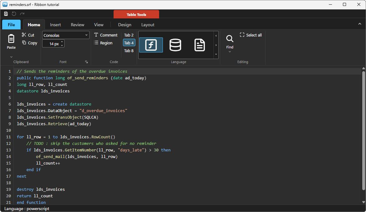
Menus and toolbars got PowerBuilder applications a long way. But a screen built around a menu object looks its age, and the users who spend their day in Word or Outlook notice. This tutorial adds a real Office-style ribbon to a PowerBuilder window with PBToolboxAI: application menu, quick access toolbar, four tabs, split buttons, drop-down lists, a spinner, a colour picker, a gallery, contextual tabs and live themes.
No ActiveX, no .NET, no COM registration: the ribbon is a regular PowerBuilder userobject, driven entirely in PowerScript, and it works from PowerBuilder 10.2 to 2025.
We will build a small script editor. The ribbon drives a PBToolboxAI code editor: cut, copy and paste, change the font and the language, comment a block, find a word, mark the lines still to review, undo and redo, switch to the dark theme. Every line of code below comes from the sample application: the window w_tuto_ribbon of the demo, opened by its Tutorials tab.
What you need #
- PowerBuilder 10.2 → 2025 (32 or 64 bit).
- Windows 10 or 11: the Microsoft WebView2 runtime the components rely on is already there.
- The PBToolboxAI demonstration package — free, from the downloads page. It holds
pbtoolboxai.pbl,pbtoolboxai.dlland the sample application of this tutorial.
The finished code. Open
pbtoolboxai_demo.pbwfrom the demonstration package and run it: the Tutorials tab of its ribbon opens the sample of this tutorial, the windoww_tuto_ribbon, with the whole ribbon. Its source is inpbtoolboxai_demo.pbl, ready to read or to copy.Demo mode. In your own application, without a licence key, the ribbon runs in demo mode: two tabs at most, and a small DEMO badge.
Step 1 — Prepare the target #
- Copy
pbtoolboxai.pblinto your application folder and add it to the library list of your target. - Copy
pbtoolboxai.dll— the x86 copy, since the PowerBuilder IDE is 32-bit — next topbXXX.exeor into the working folder of the target, so that the IDE finds it when you run. - Create an
imgfolder next to your application for the ribbon icons: one SVG file per icon (paste.svg,scissors.svg,undo.svg…). The icons of the sample are Lucide icons, free under the ISC licence.
That is the whole installation. The DLL carries everything else — the HTML, the themes, the translations — as embedded resources.
Step 2 — The application object #
Declare the three functions the application needs, then set the licence and the theme before the first window opens, so that nothing ever flashes:
// Local External Functions of the application object
Function long PBT_SetLicense (string as_client, string as_key) Library "pbtoolboxai.dll"
Function long PBT_SetDefaultTheme (string as_name) Library "pbtoolboxai.dll"
Function long PBT_Warmup () Library "pbtoolboxai.dll"
// open event of the application object
// Starts the WebView2 engine in the background while the window builds
PBT_Warmup()
// Your licence key. Without one the ribbon runs in demo mode :
// two tabs at most, and a small DEMO badge.
PBT_SetLicense(/*client*/ "Your company", /*key*/ "your-licence-key")
// The theme of every component, set BEFORE the first one is drawn
PBT_SetDefaultTheme(/*name*/ "fluent-light")
Open(w_main)PBT_Warmup() starts the browser engine while the rest of the application loads: without it, the first ribbon simply appears a little later.
Step 3 — Place the ribbon and the editor #
Open your window in the painter:
- Insert → Control → User Object, pick
u_pbt_ribbonfrompbtoolboxai.pbl, name ituo_ribbonand drop it at the top. Its height does not matter: the ribbon picks its own. - Below it, the same way, a
u_pbt_codeeditornameduo_doc: the document. - At the bottom, a
u_pbt_statusbarnameduo_status: the sample writes there what each command did, and where the caret is. One panel that takes the whole width is enough — in itsconstructorevent:this.of_add_panel("msg", "Ready", "", this.ALIGN_START, -1).
In the sample the window is called w_tuto_ribbon; in your application, any name will do.
In the painter, both components show as a gray frame that reads "PBToolboxAI component (rendered at runtime)". The real drawing happens when the application runs.
The editor is set up in the window's open event, after the ribbon is built:
// open event of the window (extract)
// The editor : PowerScript, the font of the ribbon, the caret reported
uo_doc.is_syntax = uo_doc.SYNTAX_POWERSCRIPT
uo_doc.is_font_family = "Consolas"
uo_doc.ii_font_size = 14
uo_doc.ib_track_caret = true
Step 4 — Build the ribbon #
The one rule: everything has an address #
Each tab, group and control is named by a key, and keys join into an address with /. The Paste button of the Clipboard group of the Home tab is home/clip/paste, and the Paste as a comment entry of its menu is home/clip/paste/p_comment. You use that address to build the control, to read or change it later, and you receive it back in every event. There is no handle to keep, no index to count.
Icons #
One small function turns a name into an icon path. The mono: prefix recolours the SVG with the theme, so one set of icons serves the light and the dark themes alike:
// wf_ico (string as_name) returns string
// Path of an icon of the img folder. The "mono:" prefix asks the ribbon to
// recolour the glyph with the theme, light or dark.
return "mono:img\" + Lower(as_name) + ".svg"
The demo keeps its icons in a resource DLL instead, so its wf_ico returns "mono:img\packimages.dll:SVG/SAMPLES/" + as_name: an image can be a file, or a resource of a DLL.
The application menu and the quick access toolbar #
Build everything in one window function, wf_build_ribbon, called from the open event. Freezing the drawing first paints the whole ribbon once, with no flicker:
// Freeze the drawing : the whole ribbon is built, then painted once
uo_ribbon.of_set_redraw(/*on*/ false)

// Application menu
uo_ribbon.is_app_button = "File"
uo_ribbon.of_add_app_menu_item(/*keys*/ "new", /*text*/ "New", /*image*/ wf_ico("FILE-PLUS"))
uo_ribbon.of_add_app_menu_item(/*keys*/ "open", /*text*/ "Open...", /*image*/ wf_ico("FOLDER-OPEN"))
uo_ribbon.of_add_app_menu_separator(/*keys*/ "s1")
uo_ribbon.of_add_app_menu_item(/*keys*/ "save", /*text*/ "Save", /*image*/ wf_ico("SAVE"))
uo_ribbon.of_add_app_menu_item(/*keys*/ "saveas", /*text*/ "Save as", /*image*/ "")
uo_ribbon.of_add_app_menu_item(/*keys*/ "saveas/as_pdf", /*text*/ "PDF document", /*image*/ wf_ico("FILE-TEXT"))
uo_ribbon.of_add_app_menu_item(/*keys*/ "saveas/as_png", /*text*/ "PNG picture", /*image*/ wf_ico("IMAGE"))
uo_ribbon.of_add_app_menu_separator(/*keys*/ "s2")
uo_ribbon.of_add_app_menu_item(/*keys*/ "print", /*text*/ "Print...", /*image*/ wf_ico("PRINTER"))
uo_ribbon.of_add_app_menu_separator(/*keys*/ "s3")
uo_ribbon.of_add_app_menu_item(/*keys*/ "quit", /*text*/ "Exit", /*image*/ wf_ico("LOG-OUT"))

// Quick access toolbar
uo_ribbon.of_add_qat(/*key*/ "qsave", /*image*/ wf_ico("SAVE"), /*tooltip*/ "Save (Ctrl+S)")
uo_ribbon.of_add_qat(/*key*/ "qundo", /*image*/ wf_ico("UNDO"), /*tooltip*/ "Undo (Ctrl+Z)")
uo_ribbon.of_add_qat(/*key*/ "qredo", /*image*/ wf_ico("REDO"), /*tooltip*/ "Redo (Ctrl+Y)")
saveas/as_pdf hangs under saveas: the address alone makes the cascade.
The Home tab #
// Home tab
uo_ribbon.of_add_tab(/*key*/ "home", /*title*/ "Home")
uo_ribbon.of_tab(/*key*/ "home").is_keytip = "H"

// Home tab / Clipboard group
uo_ribbon.of_add_group(/*keys*/ "home/clip", /*title*/ "Clipboard")
uo_ribbon.of_add_big_split(/*keys*/ "home/clip/paste", /*text*/ "Paste", /*image*/ wf_ico("PASTE"))
uo_ribbon.of_add_menu_item(/*keys*/ "home/clip/paste/p_all", /*text*/ "Paste", /*image*/ wf_ico("PASTE"))
uo_ribbon.of_add_menu_item(/*keys*/ "home/clip/paste/p_comment", /*text*/ "Paste as a comment", /*image*/ wf_ico("TYPE"))
uo_ribbon.of_add_button(/*keys*/ "home/clip/cut", /*text*/ "Cut", /*image*/ wf_ico("SCISSORS"))
uo_ribbon.of_add_button(/*keys*/ "home/clip/copy", /*text*/ "Copy", /*image*/ wf_ico("COPY"))

// Home tab / Font group : the editor's own font, in pixels
uo_ribbon.of_add_group(/*keys*/ "home/font", /*title*/ "Font")
uo_ribbon.of_add_combo(/*keys*/ "home/font/fontname", /*width_px*/ 150, /*editable*/ true)
uo_ribbon.of_add_combo_item(/*keys*/ "home/font/fontname", /*label*/ "Consolas")
uo_ribbon.of_add_combo_item(/*keys*/ "home/font/fontname", /*label*/ "Cascadia Mono")
uo_ribbon.of_add_combo_item(/*keys*/ "home/font/fontname", /*label*/ "Courier New")
uo_ribbon.of_item(/*keys*/ "home/font/fontname").is_value = "Consolas"
uo_ribbon.of_add_spinner(/*keys*/ "home/font/fontsize", /*width_px*/ 70, /*min*/ 9, /*max*/ 40, /*step*/ 1, /*value*/ 14)
uo_ribbon.of_item(/*keys*/ "home/font/fontsize").is_format = '0 "px"'   // shown "14 px", typed "14"
uo_ribbon.of_group(/*keys*/ "home/font").ib_launcher = true   // corner arrow : opens the full Font dialog

// Home tab / Code group
uo_ribbon.of_add_group(/*keys*/ "home/code", /*title*/ "Code")
uo_ribbon.of_add_button(/*keys*/ "home/code/comment", /*text*/ "Comment", /*image*/ wf_ico("TYPE"))
uo_ribbon.of_add_button(/*keys*/ "home/code/region", /*text*/ "Region", /*image*/ wf_ico("LIST"))
uo_ribbon.of_add_separator(/*keys*/ "home/code")
uo_ribbon.of_add_toggle(/*keys*/ "home/code/tab2", /*text*/ "Tab 2", /*image*/ "")
uo_ribbon.of_add_toggle(/*keys*/ "home/code/tab4", /*text*/ "Tab 4", /*image*/ "")
uo_ribbon.of_add_toggle(/*keys*/ "home/code/tab8", /*text*/ "Tab 8", /*image*/ "")

// The three tab toggles are exclusive : pressing one releases the others
uo_ribbon.of_item(/*keys*/ "home/code/tab2").is_group = "tabs"
uo_ribbon.of_item(/*keys*/ "home/code/tab4").is_group = "tabs"
uo_ribbon.of_item(/*keys*/ "home/code/tab8").is_group = "tabs"
uo_ribbon.of_item(/*keys*/ "home/code/tab4").ib_checked = true

// Home tab / Language group : a gallery, one tile per language
uo_ribbon.of_add_group(/*keys*/ "home/lang", /*title*/ "Language")
uo_ribbon.of_add_gallery(/*keys*/ "home/lang/syntax", /*width_px*/ 0, /*tile_w*/ 72, /*tile_h*/ 44)
uo_ribbon.of_item(/*keys*/ "home/lang/syntax").ii_visible_items = 3   // 3 tiles when closed ; the arrows reach the rest
uo_ribbon.of_add_gallery_item(/*keys*/ "home/lang/syntax/powerscript", /*image*/ wf_ico("SQUARE-FUNCTION"), /*label*/ "PowerScript")
uo_ribbon.of_add_gallery_item(/*keys*/ "home/lang/syntax/sql", /*image*/ wf_ico("DATABASE"), /*label*/ "SQL")
uo_ribbon.of_add_gallery_item(/*keys*/ "home/lang/syntax/json", /*image*/ wf_ico("FILE-TEXT"), /*label*/ "JSON")
uo_ribbon.of_add_gallery_item(/*keys*/ "home/lang/syntax/plain", /*image*/ wf_ico("ALIGN-LEFT"), /*label*/ "Plain text")
uo_ribbon.of_select_gallery_item(/*keys*/ "home/lang/syntax/powerscript")

// Home tab / Editing group
uo_ribbon.of_add_group(/*keys*/ "home/edit", /*title*/ "Editing")
uo_ribbon.of_add_big_dropdown(/*keys*/ "home/edit/find", /*text*/ "Find", /*image*/ wf_ico("FIND"))
uo_ribbon.of_add_menu_item(/*keys*/ "home/edit/find/f_find", /*text*/ "Find...", /*image*/ wf_ico("FIND"))
uo_ribbon.of_add_menu_item(/*keys*/ "home/edit/find/f_replace", /*text*/ "Replace...", /*image*/ wf_ico("REPLACE"))
uo_ribbon.of_add_menu_separator(/*keys*/ "home/edit/find")
uo_ribbon.of_add_menu_check(/*keys*/ "home/edit/find/f_case", /*text*/ "Match case")
uo_ribbon.of_add_menu_check(/*keys*/ "home/edit/find/f_word", /*text*/ "Whole word")
uo_ribbon.of_add_button(/*keys*/ "home/edit/selall", /*text*/ "Select all", /*image*/ wf_ico("MAXIMIZE"))
A few things worth noticing:
- Big and small.
of_add_big_*makes a tall button with its label below; the small ones stack three to a column. The ribbon shrinks its groups by itself when the window gets narrow. - Split or drop-down. A split button (
of_add_big_split) has a main part that acts at once and an arrow that opens its menu; a drop-down (of_add_big_dropdown) only opens its menu. Menu entries are added under the button's address. - Properties, not setters. After a control exists, you change it by assigning a property of its handle:
of_item("home/font/fontname").is_value = "Consolas". There is noof_set_xxxto remember. - Exclusive toggles. Giving several toggles the same
is_groupmakes them behave like radio buttons: pressing Tab 2 releases Tab 4 by itself. A toggle with no image shows its text alone. - Keytips.
is_keytip = "H"lets the user press Alt, then H, to open the Home tab from the keyboard, as in Office.
The Insert, Review and View tabs #
They follow the same pattern. The Review tab holds the commands whose state changes with the document — the next step greys them when they have nothing to do:
// Review tab
uo_ribbon.of_add_tab(/*key*/ "review", /*title*/ "Review")
uo_ribbon.of_tab(/*key*/ "review").is_keytip = "R"

// Review tab / Diagnostics group : markers in the gutter of the editor
uo_ribbon.of_add_group(/*keys*/ "review/diag", /*title*/ "Diagnostics")
uo_ribbon.of_add_big_button(/*keys*/ "review/diag/check", /*text*/ "Check", /*image*/ wf_ico("CHECK"))
uo_ribbon.of_add_button(/*keys*/ "review/diag/next", /*text*/ "Next issue", /*image*/ wf_ico("ARROW-DOWN-A-Z"))
uo_ribbon.of_add_button(/*keys*/ "review/diag/clear", /*text*/ "Clear marks", /*image*/ wf_ico("ERASER"))

// Review tab / History group : greyed while there is nothing to undo or redo
uo_ribbon.of_add_group(/*keys*/ "review/hist", /*title*/ "History")
uo_ribbon.of_add_big_button(/*keys*/ "review/hist/undo", /*text*/ "Undo", /*image*/ wf_ico("UNDO"))
uo_ribbon.of_add_big_button(/*keys*/ "review/hist/redo", /*text*/ "Redo", /*image*/ wf_ico("REDO"))
The View tab mirrors properties of the editor with check boxes, and holds the theme commands:
// View tab
uo_ribbon.of_add_tab(/*key*/ "view", /*title*/ "View")
uo_ribbon.of_tab(/*key*/ "view").is_keytip = "W"

// View tab / Zoom group
uo_ribbon.of_add_group(/*keys*/ "view/zoom", /*title*/ "Zoom")
uo_ribbon.of_add_big_button(/*keys*/ "view/zoom/zin", /*text*/ "Zoom in", /*image*/ wf_ico("ZOOM-IN"))
uo_ribbon.of_add_big_button(/*keys*/ "view/zoom/zout", /*text*/ "Zoom out", /*image*/ wf_ico("ZOOM-OUT"))
uo_ribbon.of_add_button(/*keys*/ "view/zoom/reset", /*text*/ "Default size", /*image*/ wf_ico("MAXIMIZE"))

// View tab / Show group : check boxes that mirror the editor's properties
uo_ribbon.of_add_group(/*keys*/ "view/show", /*title*/ "Show")
uo_ribbon.of_add_checkbox(/*keys*/ "view/show/numbers", /*text*/ "Line numbers")
uo_ribbon.of_add_checkbox(/*keys*/ "view/show/current", /*text*/ "Current line")
uo_ribbon.of_add_checkbox(/*keys*/ "view/show/wrap", /*text*/ "Word wrap")
uo_ribbon.of_item(/*keys*/ "view/show/numbers").ib_checked = true
uo_ribbon.of_item(/*keys*/ "view/show/current").ib_checked = true

// View tab / Appearance group
uo_ribbon.of_add_group(/*keys*/ "view/look", /*title*/ "Appearance")
uo_ribbon.of_add_toggle(/*keys*/ "view/look/dark", /*text*/ "Dark mode", /*image*/ wf_ico("EYE"))
uo_ribbon.of_add_colorpicker(/*keys*/ "view/look/accent", /*text*/ "Accent", /*image*/ wf_ico("PAINTBRUSH"), /*color*/ RGB(/*red*/ 0, /*green*/ 120, /*blue*/ 212), /*mode*/ u_pbt_ribbon.COLORMODE_OPEN)
The Insert tab adds snippets — an if block, a for loop, a date, a link — and a Table button that shows a contextual tab.
Contextual tabs #
Office shows the Table Tools tabs only when a table is selected. A contextual tab is built like any other, then shown or hidden through its ib_visible property. It can stand alone, marked by a coloured edge, or sit with others under a coloured banner, a contextual group:
// Standalone contextual tab : hidden until a table is inserted
uo_ribbon.of_add_contextual_tab(/*key*/ "ttools", /*title*/ "Quick Table", /*color*/ RGB(/*red*/ 40, /*green*/ 120, /*blue*/ 200))
uo_ribbon.of_add_group(/*keys*/ "ttools/trows", /*title*/ "Rows and columns")
uo_ribbon.of_add_big_button(/*keys*/ "ttools/trows/addrow", /*text*/ "Insert row", /*image*/ wf_ico("ROWS-3"))
uo_ribbon.of_add_big_button(/*keys*/ "ttools/trows/addcol", /*text*/ "Insert column", /*image*/ wf_ico("COLUMNS-3"))
uo_ribbon.of_add_button(/*keys*/ "ttools/trows/delrow", /*text*/ "Delete", /*image*/ wf_ico("TRASH-2"))
uo_ribbon.of_add_button(/*keys*/ "ttools/trows/props", /*text*/ "Properties", /*image*/ wf_ico("WRENCH"))
uo_ribbon.of_tab(/*key*/ "ttools").ib_visible = false

// Contextual "Table tools" group
uo_ribbon.of_add_contextual_group(/*key*/ "tbl", /*title*/ "Table Tools", /*color*/ RGB(/*red*/ 200, /*green*/ 60, /*blue*/ 40))

// Contextual "Table tools" group / Design tab
uo_ribbon.of_add_contextual_tab(/*key*/ "tdesign", /*title*/ "Design", /*group_key*/ "tbl")
uo_ribbon.of_add_group(/*keys*/ "tdesign/trows2", /*title*/ "Rows and columns")
uo_ribbon.of_add_big_button(/*keys*/ "tdesign/trows2/addrow2", /*text*/ "Insert row", /*image*/ wf_ico("ROWS-3"))
uo_ribbon.of_add_big_button(/*keys*/ "tdesign/trows2/addcol2", /*text*/ "Insert column", /*image*/ wf_ico("COLUMNS-3"))
uo_ribbon.of_add_button(/*keys*/ "tdesign/trows2/delrow2", /*text*/ "Delete", /*image*/ wf_ico("TRASH-2"))
uo_ribbon.of_tab(/*key*/ "tdesign").ib_visible = true
The function ends by painting everything at once:
// Paint everything at once, then start on the home tab
uo_ribbon.of_set_redraw(/*on*/ true)
uo_ribbon.of_select_tab(/*key*/ "home")
Step 5 — React to the user: one router per event #
The ribbon raises typed PowerBuilder events, and each one carries the full address of the control. A single choose case per event is all the routing you need.
Buttons: ue_clicked #
// ue_clicked event of uo_ribbon : (string as_keys)
// One router for every button : the address names the command.
// A quick access toolbar button arrives with its key alone.
choose case as_keys
	case "home/clip/paste"
		// The main part of the split button : the text goes in at the caret
		if Len(Clipboard()) > 0 then uo_doc.of_insert_text(/*text*/ Clipboard())
	case "home/clip/cut"
		parent.wf_cut()
	case "home/clip/copy"
		Clipboard(uo_doc.is_selected_text)
	case "home/code/comment"
		// The comment of the language : // in PowerScript, -- in SQL
		uo_doc.of_toggle_comment()
	case "home/edit/selall"
		// A column past the end of its line stops at that end
		uo_doc.of_select_range(/*from_line*/ 1, /*from_col*/ 1, /*to_line*/ uo_doc.il_line_count, /*to_col*/ 32767)
	case "insert/tables/table"
		// A table arrives : its contextual tab appears, and opens
		uo_doc.of_insert_text(/*text*/ "CREATE TABLE customer (~r~n~tid integer NOT NULL,~r~n~tname varchar(60)~r~n);~r~n")
		this.of_tab(/*key*/ "ttools").ib_visible = true
		this.of_select_tab(/*key*/ "ttools")
	case "review/diag/check"
		parent.wf_check()
	case "review/diag/next"
		// What F8 does : the caret goes to the next marker, its message shows
		if uo_doc.of_next_marker() = 0 then parent.wf_status("No issue : run Check first")
	case "review/hist/undo", "qundo"
		uo_doc.of_undo()
	case "review/hist/redo", "qredo"
		uo_doc.of_redo()
	case "view/zoom/zin"
		parent.wf_set_size(Min(uo_doc.ii_font_size + 2, 40))
	case "view/zoom/zout"
		parent.wf_set_size(Max(uo_doc.ii_font_size - 2, 9))
	case "qsave"
		parent.wf_save()
	case else
		// Commands this small editor has nothing to do with
		parent.wf_status("Clicked : " + as_keys)
end choose

// The keyboard goes back to the editor, and Paste follows the clipboard
uo_doc.SetFocus()
parent.wf_refresh_commands()
(The sample handles a few more commands — the snippets, the region, the zoom reset: the pattern is the same.) The case else is worth keeping in a real application too: during development, it tells you at once which commands are not wired yet.
of_insert_text puts the text at the caret, as if the user had typed it — the selection is replaced, and Ctrl+Z undoes it. The editor keeps its own clipboard work to the keyboard (Ctrl+X, Ctrl+C, Ctrl+V); a Cut button copies the selection, then deletes it:
// wf_cut ()
// The editor has no clipboard of its own : the selection is copied, then deleted
if uo_doc.is_selected_text = "" then
	wf_status("Cut : select some text first")
	return
end if
Clipboard(uo_doc.is_selected_text)
uo_doc.of_delete_selection()
Check is a small review: every line that still holds a TODO gets a warning in the gutter, and Next issue (or F8) goes from one to the next:
// wf_check ()
// Local variables
string ls_text
long ll_line, ll_start, ll_end, ll_found

// A small review : every line that still holds a TODO gets a warning in the gutter
uo_doc.of_clear_markers()
ls_text = uo_doc.is_text + "~n"
ll_line = 1
ll_start = 1
ll_end = Pos(ls_text, "~n", ll_start)
do while ll_end > 0
	if Pos(Mid(ls_text, ll_start, ll_end - ll_start), "TODO") > 0 then
		uo_doc.of_add_marker(/*line*/ ll_line, /*kind*/ uo_doc.MARKER_WARNING, /*tooltip*/ "A [b]TODO[/b] is left on this line")
		ll_found++
	end if
	ll_line++
	ll_start = ll_end + 1
	ll_end = Pos(ls_text, "~n", ll_start)
loop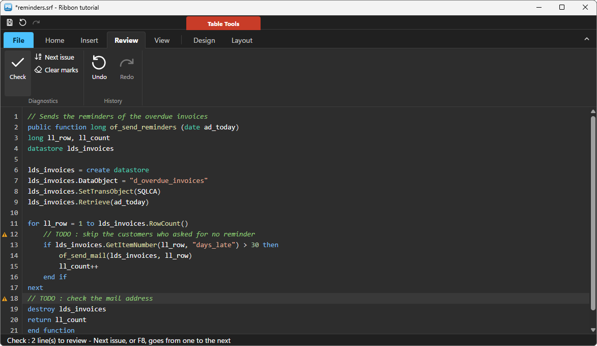
Menu entries: ue_menu_selected #
The entries of a split or drop-down button arrive with their full address. A check entry flips first, and ab_checked carries its new state:
// ue_menu_selected event of uo_ribbon : (string as_keys, boolean ab_checked)
// Local variables
string ls_text

// An entry of the menu of a split or drop-down button : its full address
choose case as_keys
	case "home/clip/paste/p_all"
		if Len(Clipboard()) > 0 then uo_doc.of_insert_text(/*text*/ Clipboard())
	case "home/clip/paste/p_comment"
		// The text of the clipboard, behind a comment mark
		ls_text = Clipboard()
		if ls_text <> "" then uo_doc.of_insert_text(/*text*/ "// " + ls_text)
	case "home/edit/find/f_find"
		// The search bar of the editor opens, filled with the selection
		uo_doc.of_find(/*text*/ uo_doc.is_selected_text)
	case "home/edit/find/f_case"
		// A check entry : ab_checked is its new state
		uo_doc.ib_find_match_case = ab_checked
	case "home/edit/find/f_word"
		uo_doc.ib_find_whole_word = ab_checked
	case else
		parent.wf_status("Menu : " + as_keys)
end choose
Toggles and check boxes: ue_toggled #
// ue_toggled event of uo_ribbon : (string as_keys, boolean ab_checked)
choose case as_keys
	case "home/code/tab2"
		// The tab group : only the toggle pressed raises the event
		uo_doc.ii_tab_size = 2
	case "home/code/tab4"
		uo_doc.ii_tab_size = 4
	case "home/code/tab8"
		uo_doc.ii_tab_size = 8
	case "view/show/numbers"
		uo_doc.ib_line_numbers = ab_checked
	case "view/show/current"
		uo_doc.ib_current_line = ab_checked
	case "view/show/wrap"
		uo_doc.ib_wrap = ab_checked
	case "view/look/dark"
		if ab_checked then parent.is_mode = "dark" else parent.is_mode = "light"
		parent.wf_apply_theme()
	case else
		parent.wf_status("Toggled : " + as_keys + " = " + String(ab_checked))
end choose
For the three exclusive tab toggles, the ribbon raises one event — for the toggle that comes on. The one that lets go stays silent, so there is nothing to filter.
The font list, the spinner, the colour #
// ue_combo_changed event of uo_ribbon : (string as_keys, string as_text)
// The font list is editable : as_text is the entry chosen, or typed
if as_keys = "home/font/fontname" then uo_doc.is_font_family = as_text
// ue_value_changed event of uo_ribbon : (string as_keys, double ad_value)
// The size spinner moved : the editor takes the new size, in pixels
if as_keys = "home/font/fontsize" then uo_doc.ii_font_size = Integer(ad_value)// ue_color_changed event of uo_ribbon : (string as_keys, long al_color)
// The colour picker : al_color is a PowerBuilder colour, the accent of the editor
if as_keys = "view/look/accent" then uo_doc.il_theme_accent = al_colorThe gallery: ue_gallery_selection_changed #
// ue_gallery_selection_changed event of uo_ribbon : (string as_from_keys, string as_keys)
// Local variables
n_pbt_utils lnv_utils   // autoinstantiate : nothing to create, nothing to destroy

// A language tile was picked : the last level of the address names the language
parent.wf_set_language(lnv_utils.of_leaf(/*keys*/ as_keys))
// wf_set_language (string as_language)
// The highlighting follows the tile of the gallery
choose case as_language
case "powerscript"
uo_doc.is_syntax = uo_doc.SYNTAX_POWERSCRIPT
case "sql"
uo_doc.is_syntax = uo_doc.SYNTAX_SQL
case "json"
uo_doc.is_syntax = uo_doc.SYNTAX_JSON
case else
uo_doc.is_syntax = uo_doc.SYNTAX_NONE
end chooseThe application menu: ue_app_menu_selected #
// ue_app_menu_selected event of uo_ribbon : (string as_keys)
// Local variables
string ls_path, ls_name

// The File menu : its entries are named by their address
choose case as_keys
	case "new"
		parent.wf_new()
	case "open"
		parent.wf_open()
	case "save"
		parent.wf_save()
	case "saveas/as_pdf"
		// The editor writes itself to a PDF file, colours included
		if GetFileSaveName("Save as PDF", ls_path, ls_name, "pdf", "PDF documents (*.pdf),*.pdf", /*initdir*/ "", OFN_EXPLORER + OFN_NOCHANGEDIR) = 1 then
			uo_doc.of_print_to_pdf(/*path*/ ls_path)
		end if
	case "print"
		parent.wf_print()
	case "quit"
		Close(parent)
	case else
		parent.wf_status("File menu : " + as_keys)
end choose
OFN_EXPLORER (2) and OFN_NOCHANGEDIR (64) are two constants of the window, in PowerBuilder values: the Explorer-style dialog, and the current folder of the application left where it was — without the second one, every relative path used afterwards resolves in the folder the user just visited.
wf_new, wf_open and wf_save are plain PowerScript (GetFileOpenName, FileOpen, FileReadEx…) around uo_doc.is_text: they are in the sample, and nothing in them is specific to the ribbon. wf_print is one line, uo_doc.of_print(): the editor prints what it shows, colours included.
Step 6 — Keep the ribbon in sync with the document #
The ribbon shows the state of the document. Some of that state belongs to the editor, which says when it changes: Undo and Redo, in the History group and in the quick access toolbar, follow the editor's history:
// ue_undo_state_changed event of uo_doc : (boolean ab_can_undo, boolean ab_can_redo)
// Undo and Redo, in the History group and in the quick access toolbar,
// are greyed while there is nothing to undo or redo
uo_ribbon.of_item(/*keys*/ "review/hist/undo").ib_enabled = ab_can_undo
uo_ribbon.of_item(/*keys*/ "review/hist/redo").ib_enabled = ab_can_redo
uo_ribbon.of_qat_item(/*key*/ "qundo").ib_enabled = ab_can_undo
uo_ribbon.of_qat_item(/*key*/ "qredo").ib_enabled = ab_can_redo
// ue_modified_changed event of uo_doc : (boolean ab_modified)
// The first change after a load or a save, or an undo back to it : the title follows
parent.wf_title()wf_title puts a star in the title bar while uo_doc.ib_modified is true, and wf_save sets it back to false once the file is written. A new text written by your code (is_text) empties the history without raising ue_undo_state_changed: the functions that load a document grey the two buttons themselves.
When the code changes the document, it tells the ribbon. The zoom buttons change the size, and the spinner must show it:
// wf_set_size (double ad_size)
// The editor takes the size, in pixels, and the spinner shows it.
// Writing id_value from code raises nothing : no loop.
uo_doc.ii_font_size = Integer(ad_size)
uo_ribbon.of_item(/*keys*/ "home/font/fontsize").id_value = ad_size
The comment is the important part: assigning a value from code (is_value, ib_checked, id_value) never raises the matching event, so syncing the ribbon never triggers your handlers again.
A command can also be greyed by the window. Paste only makes sense when the clipboard holds text:
// wf_refresh_commands ()
// Paste is only offered when the clipboard holds some text
uo_ribbon.of_item(/*keys*/ "home/clip/paste").ib_enabled = (Len(Clipboard()) > 0)
Call it after each command (it closes the ue_clicked router above) and from the window's activate event: the user may come back from another application with something new in the clipboard.
Step 7 — Layout: the ribbon decides its height #
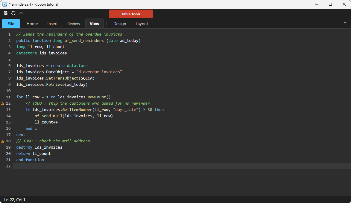
A ribbon is as tall as its content needs: a different theme, a folded ribbon, larger fonts all change its height. So you never size it vertically; you only give it its width, and you place the rest of the window below it.
// wf_layout ()
// The ribbon spans the window ; its height is its own (ue_auto_height)
uo_ribbon.x = 0
uo_ribbon.y = 0
uo_ribbon.width = this.WorkSpaceWidth()

// The status bar sits at the bottom
uo_status.of_dock_bottom()

// The editor fills what is left between them
uo_doc.x = 0
uo_doc.y = uo_ribbon.y + uo_ribbon.height
uo_doc.width = this.WorkSpaceWidth()
uo_doc.height = uo_status.y - uo_doc.y
Call it from two places: the window's resize event, and the ribbon's ue_auto_height event, which is raised each time the ribbon has just taken a new height:
// resize event of the window
wf_layout()
// ue_auto_height event of uo_ribbon : (long al_height)
// The ribbon took its new height (a new theme, folded...) : the editor follows
parent.wf_layout()The user can fold the ribbon with the chevron at the end of the tab row, or by double-clicking a tab; the editor then moves up on its own:
Step 8 — Themes, live #
A theme name has two halves, a style and a mode: fluent-light, office2007-dark, metro-light… Ten themes in all. For the whole application, switching is one call, and every PBToolboxAI component follows at once:
// Global External Functions of the application
Function long PBT_SetDefaultTheme (string as_name) Library "pbtoolboxai.dll"
// Every component of the application, live
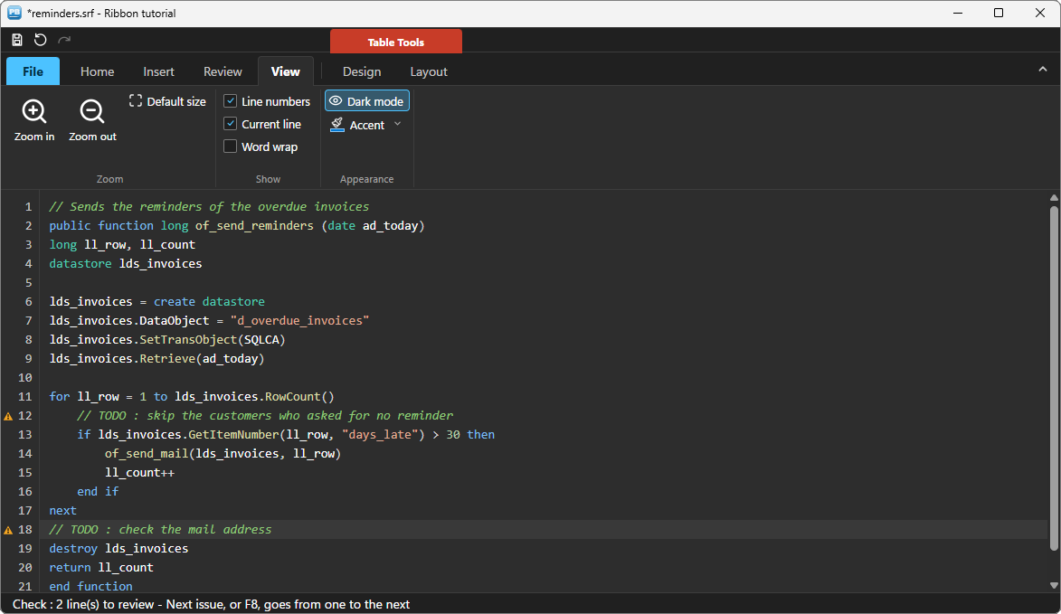
PBT_SetDefaultTheme(/*name*/ "office2007-dark")A single component can also take a mode of its own, through its properties. The sample does that — it lives inside the demo, and its Dark mode button must not switch the whole demo. The ribbon and the editor are both PBToolboxAI components, so both take the mode:
// wf_apply_theme ()
// The mode of THIS window only : the rest of the application keeps its theme.
// For every component at once : PBT_SetDefaultTheme("fluent-dark")
if is_mode = "dark" then
	uo_ribbon.is_theme_mode = uo_ribbon.THEME_MODE_DARK
	uo_doc.is_theme_mode = uo_doc.THEME_MODE_DARK
else
	uo_ribbon.is_theme_mode = uo_ribbon.THEME_MODE_LIGHT
	uo_doc.is_theme_mode = uo_doc.THEME_MODE_LIGHT
end if
One last detail makes the window feel finished. Each time its theme changes, the ribbon computes its background colour and reports it with ue_bg_color. The window takes it, so that no band of another colour shows around the ribbon — and since a dark background means a dark theme, the window also learns the mode there, whatever theme it opened in:
// ue_bg_color event of uo_ribbon : (long al_color)
// The theme's background changed (a new theme, a new mode) : the window follows
parent.wf_follow_background(al_color)
// wf_follow_background (long al_color)
// Local variables
long ll_red, ll_green, ll_blue
// The theme's background : the window takes it too (the editor and the status
// bar follow the theme by themselves)
this.backcolor = al_color
// A dark background means a dark theme : the mode is read, not assumed
ll_red = Mod(al_color, 256)
ll_green = Mod(Int(al_color / 256), 256)
ll_blue = Mod(Int(al_color / 65536), 256)
if (ll_red * 299 + ll_green * 587 + ll_blue * 114) / 1000 < 128 then
is_mode = "dark"
else
is_mode = "light"
end if
// The Dark mode toggle shows it : writing ib_checked from code raises nothing
uo_ribbon.of_item(/*keys*/ "view/look/dark").ib_checked = (is_mode = "dark")Only the window needs the colour: the ribbon, the editor and the status bar redraw themselves. (In the sample, a guard protects this function: the ribbon may report its background before it is built, so the window keeps the colour and replays it at the end of its open event.)
Deploying #
Next to your executable, ship:
my_app.exe
pbtoolboxai.dll     <- the x86 or the x64 copy, matching your build
img\                <- the ribbon icons
The DLL has the same name in 32 and 64 bit: you develop in the 32-bit IDE and compile a 64-bit executable without changing a line of PowerScript — only the copied file changes. Call PBT_SetLicense with your key in the application open event, and the demo badge and the two-tab limit go away.
Going further #
The ribbon does more than this tutorial shows:
- Super tooltips with a title, a text and an image.
- Veto events: ask the application before a gallery tile changes, and say no.
- Item colours, to highlight a command or a whole group.
n_pbt_menu2ribbon, which reads an existing PowerBuildermenuand writes the ribbon code for you — the quickest way to migrate an old screen.
Every method, property and event is in the ribbon reference, and the editor's in the code editor reference.
And if you write PowerScript with Claude, Cursor or VS Code, connect them to the PBToolboxAI documentation MCP server: your assistant then looks up the exact API instead of guessing, and checks the code it proposes. The code of this tutorial was checked that way.
Download: the PBToolboxAI demonstration package — free: the library, the DLL, and the sample of this tutorial in the Tutorials tab of the demo.